
A refined brand strategy for a U.S. cannabis packaging manufacturer
SpeedLeaf
Brand Strategy, Brand Identity & Logo, Website Assets, Social Media Templates, Copywriting
services
Introduce SpeedLeaf to the cannabis market as a reliable and premier packaging provider, highlighting their exceptional customer service, local advantage, and expertise in plastics manufacturing.
the challenge
the outcome
SpeedLeaf went from a homegrown idea to shipping millions of pre-roll tubes across the U.S with 100% customer retention. With confidence and clarity, their sales team makes effective pitches supported by branded sales tools developed by Clarke Creative.
-
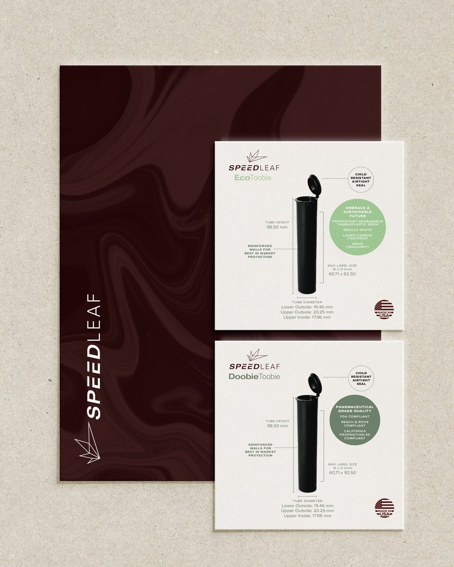
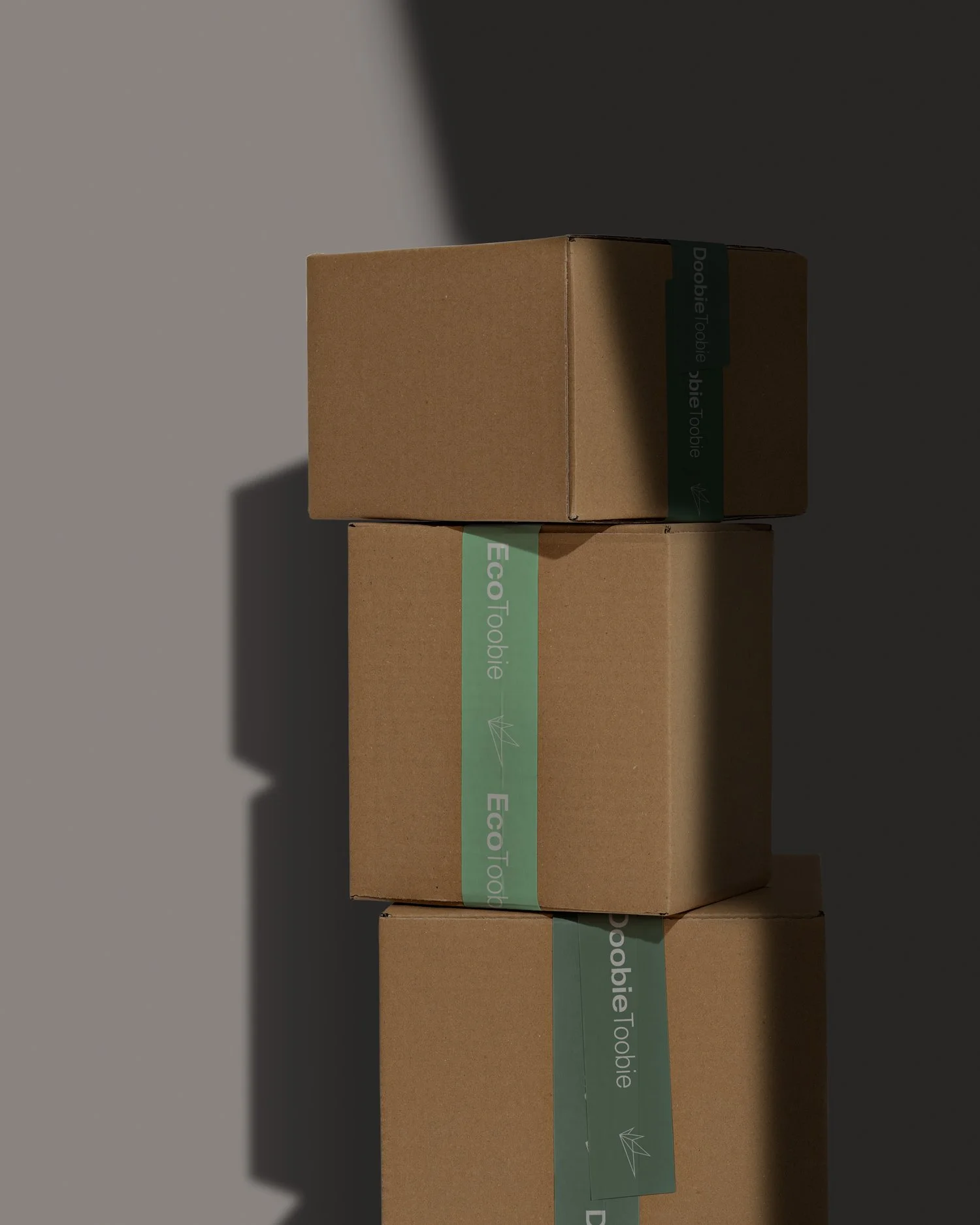
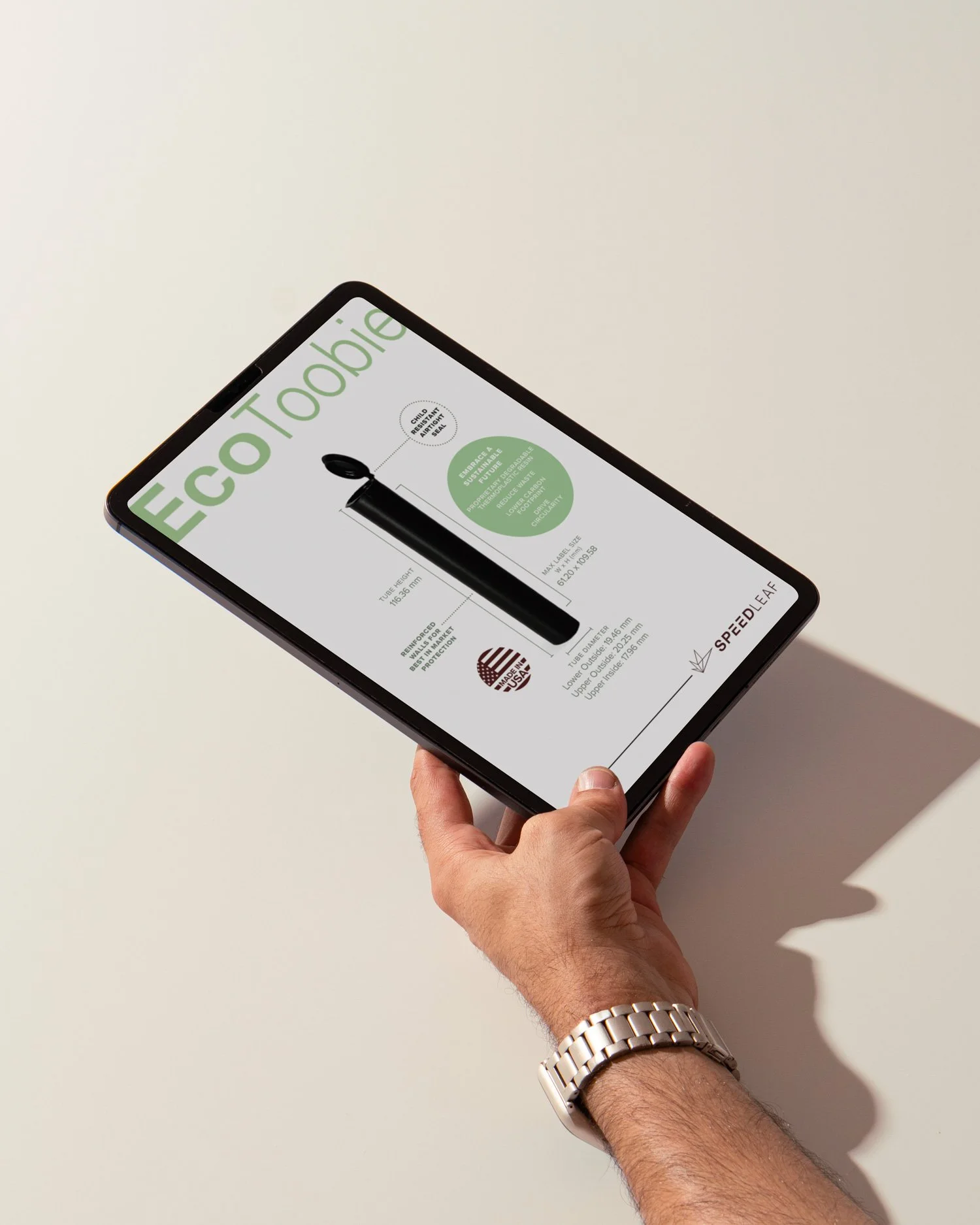
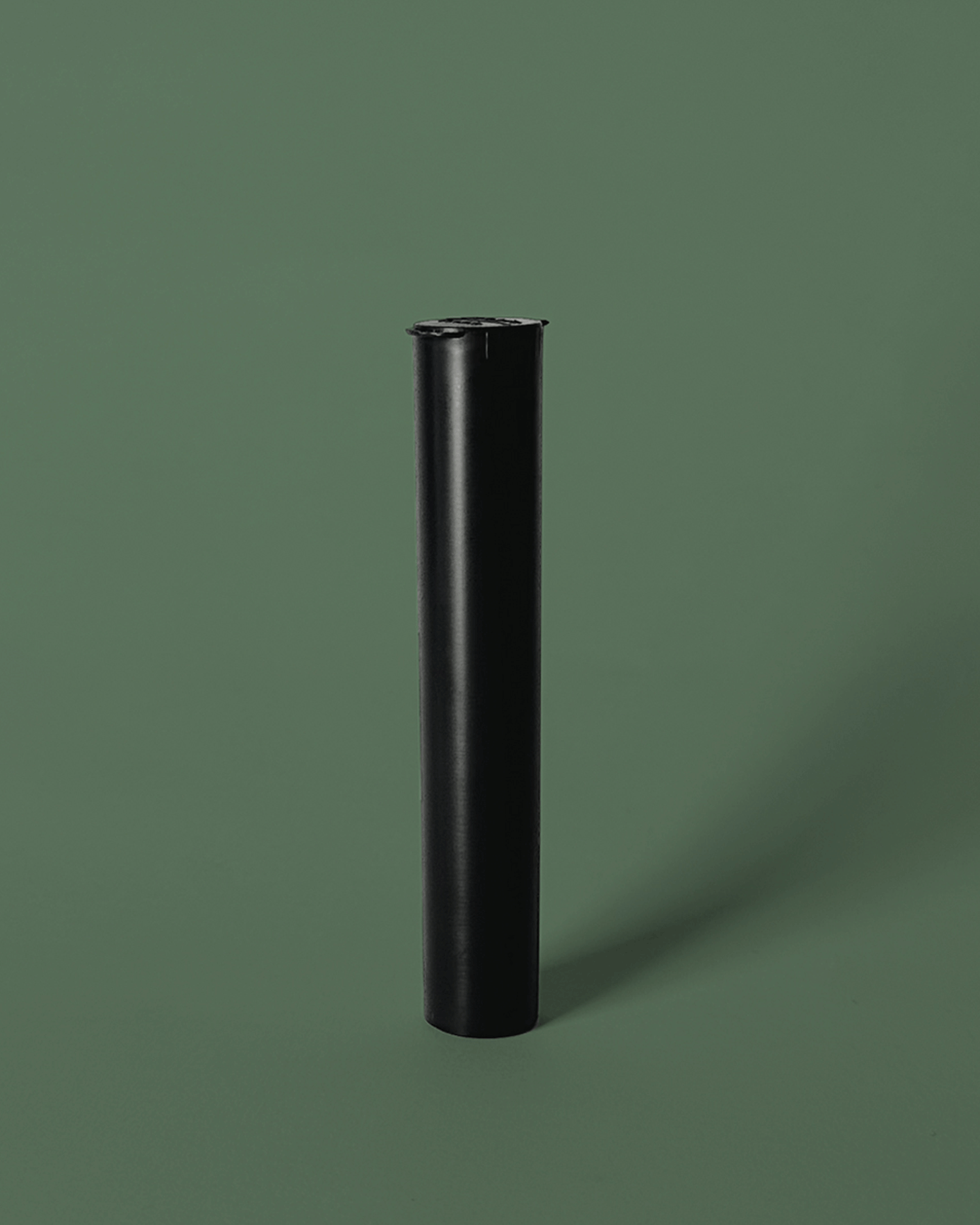
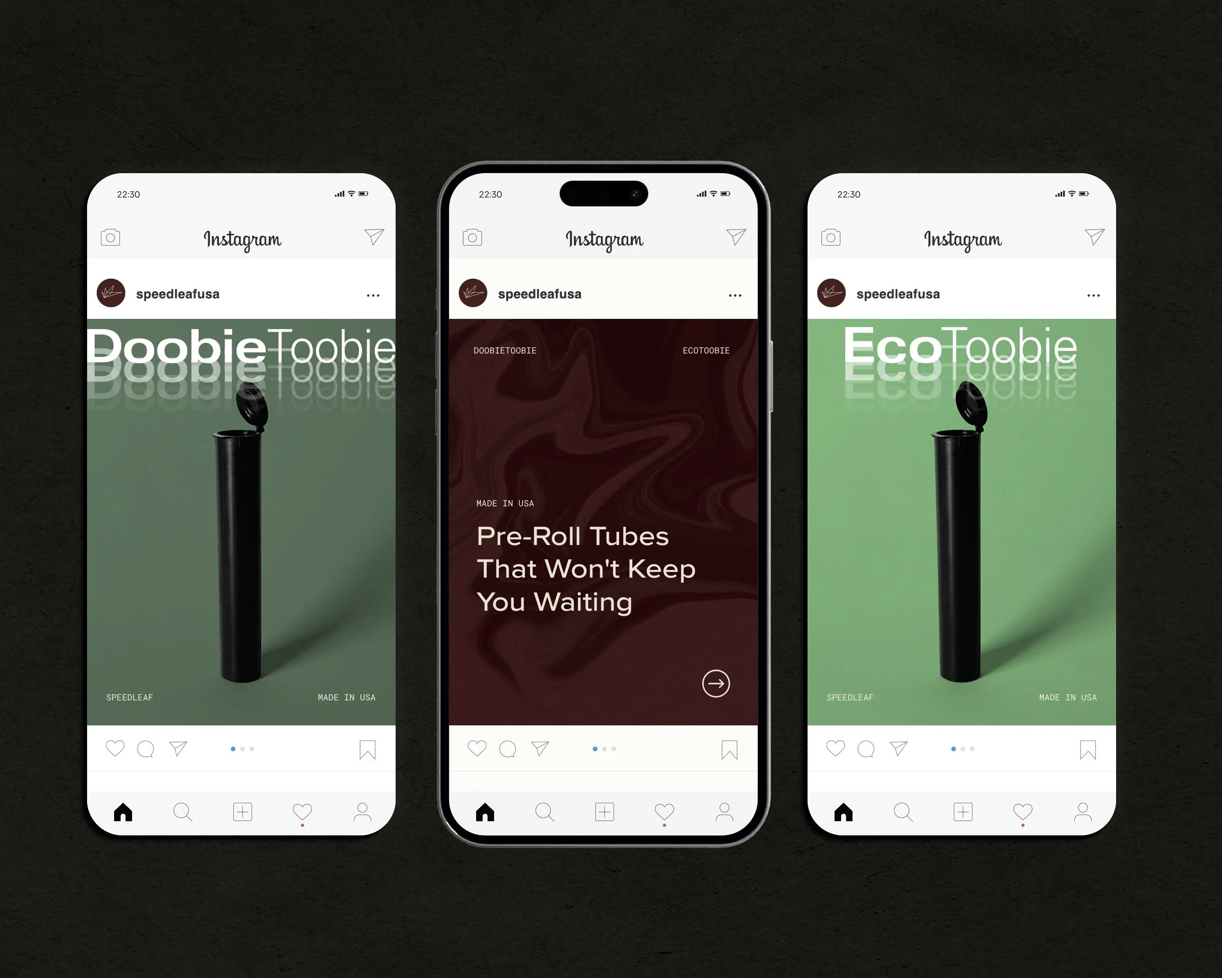
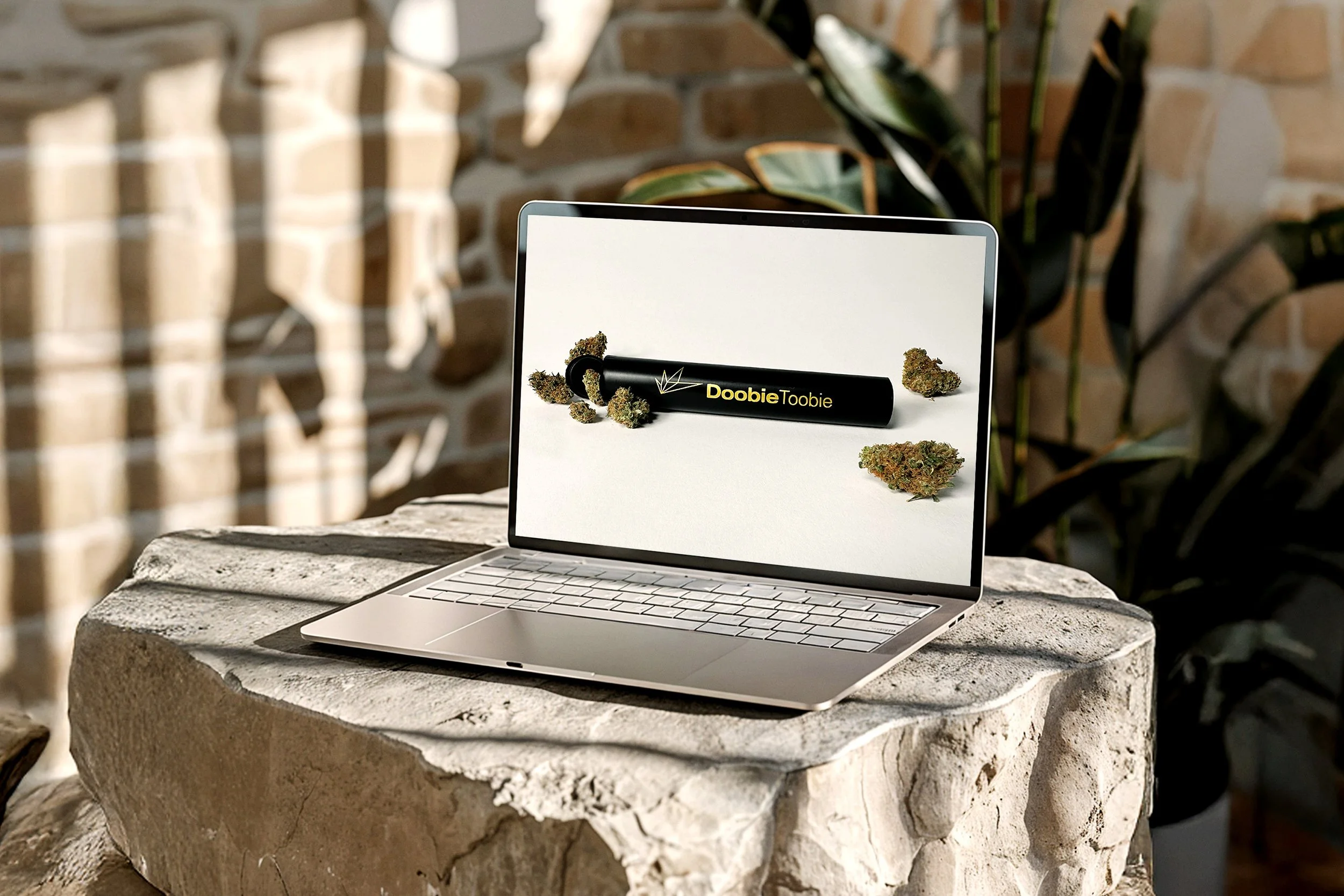
With more than 50 years of combined expertise in the plastics industry, SpeedLeaf’s owners set out to deliver a more reliable cannabis packaging solution for U.S. growers. SpeedLeaf's initial product line featured two cannabis pre-roll packaging solutions: the DoobieToobie and EcoToobie. Both are child-resistant, airtight tubes constructed from their premium, pharmaceutical-grade plastic.
With the goal of expanding its product line in the future, they asked Clarke Creative to develop a flexible brand identity and confident brand voice that establishes SpeedLeaf as a top-tier, trusted partner for U.S. cannabis producers.
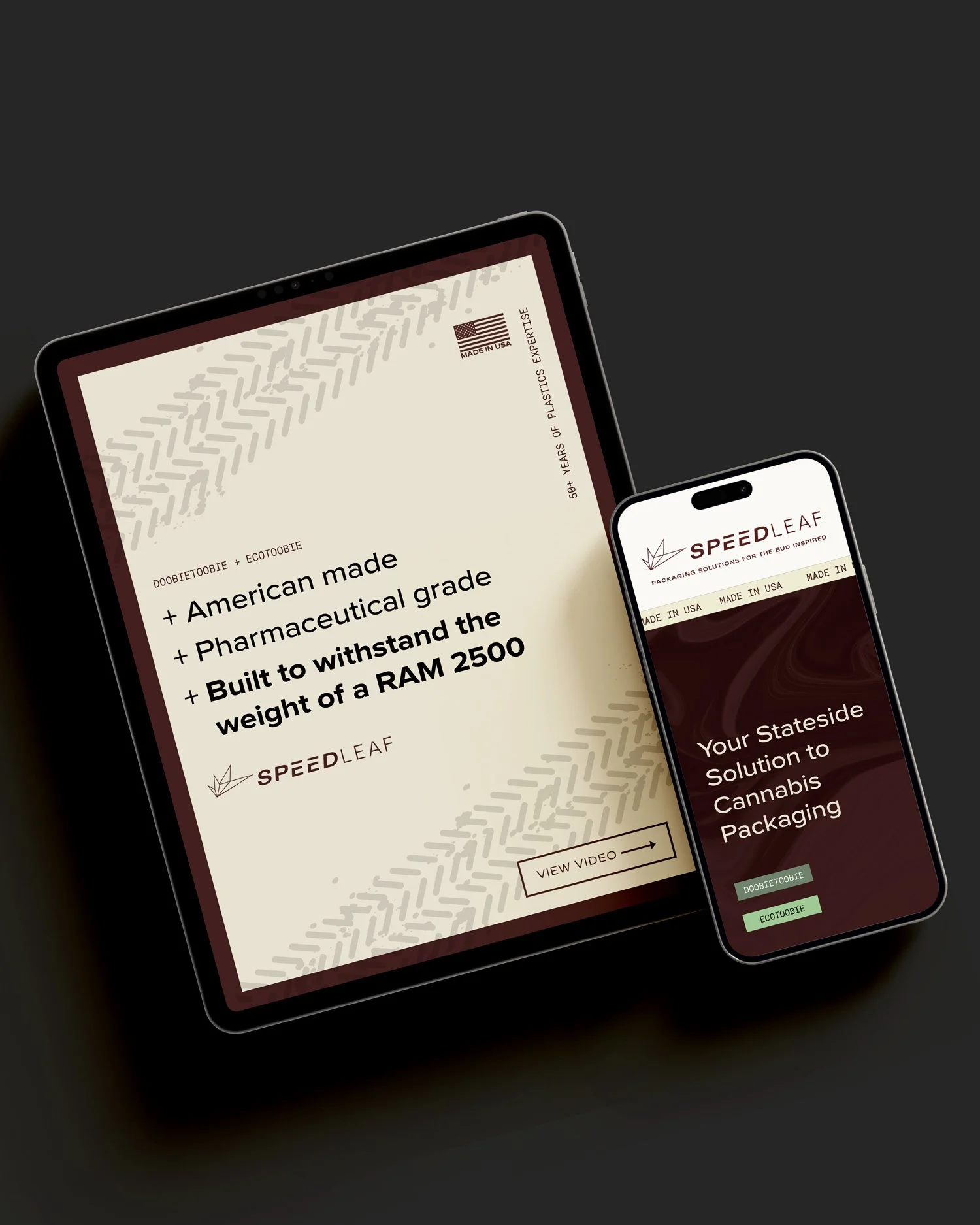
Elevated Brand Positioning. SpeedLeaf recognized significant difficulties faced by cannabis cultivators dealing with international packaging suppliers, including substantial costs, delayed deliveries, and inadequate customer service. Keeping these challenges in mind, Clarke Creative researched the competition to gain insight on their market positions and brand identities. Applying new knowledge, we sought to craft a brand identity that communicates SpeedLeaf’s key differentiators: rapid response, trustworthiness, plastics expertise, and American-made advantage.
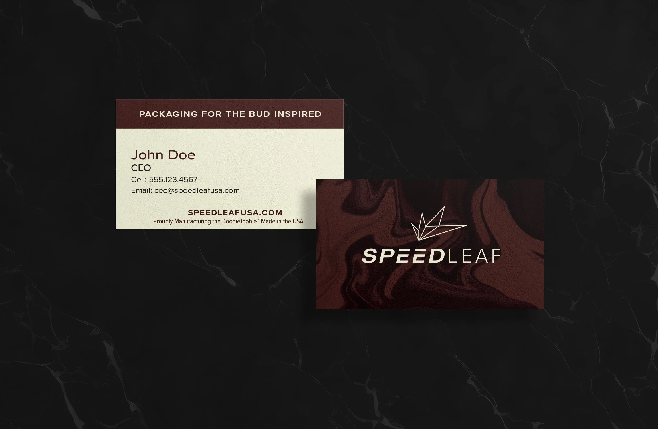
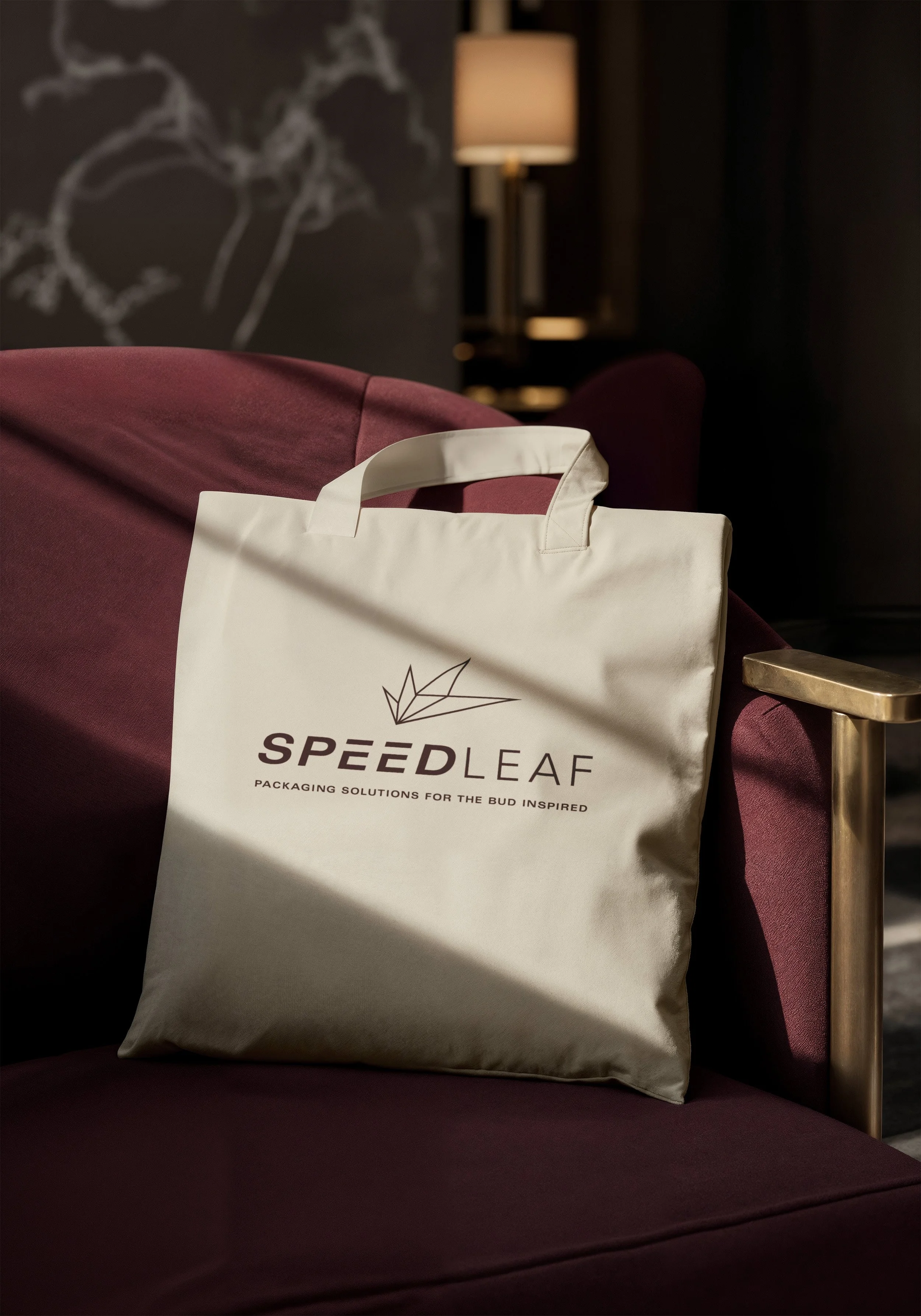
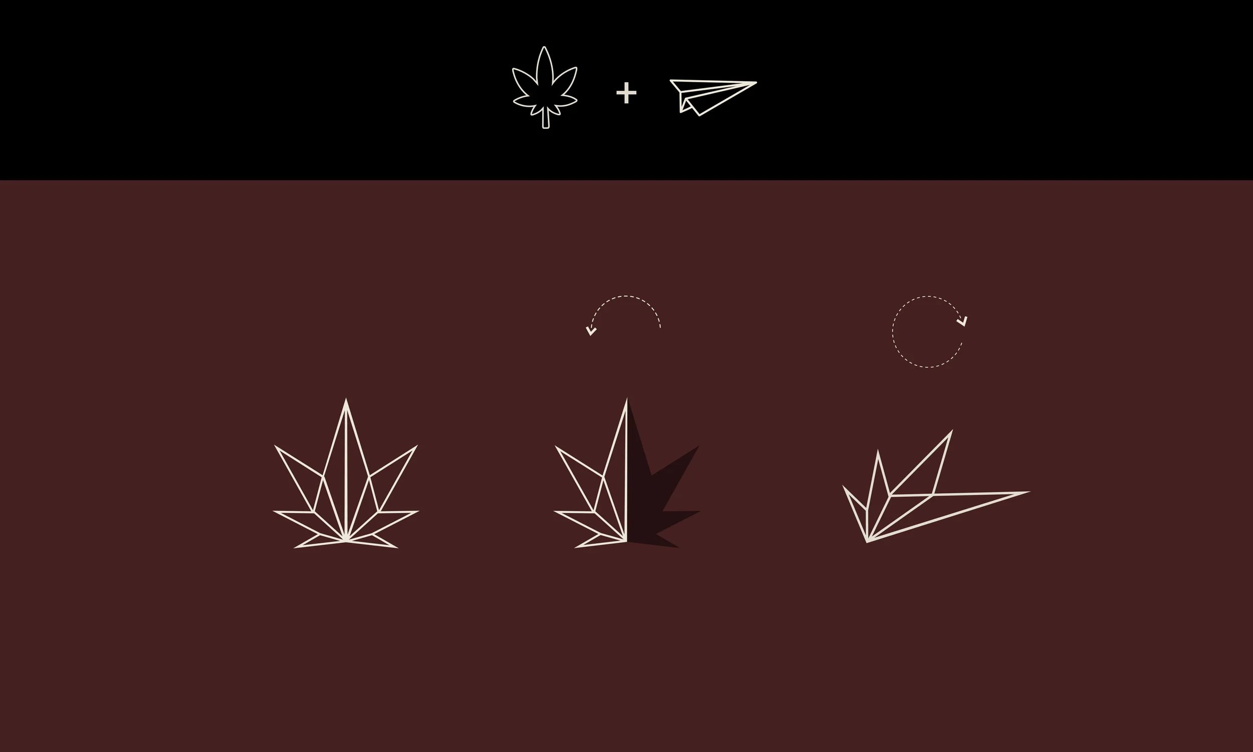
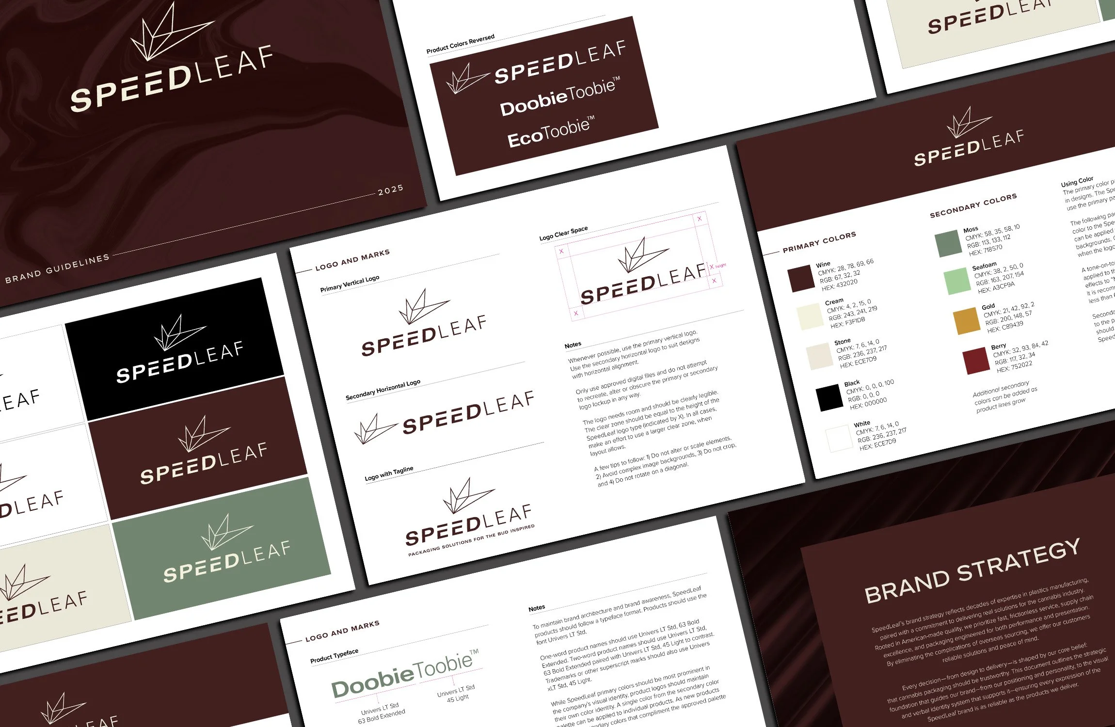
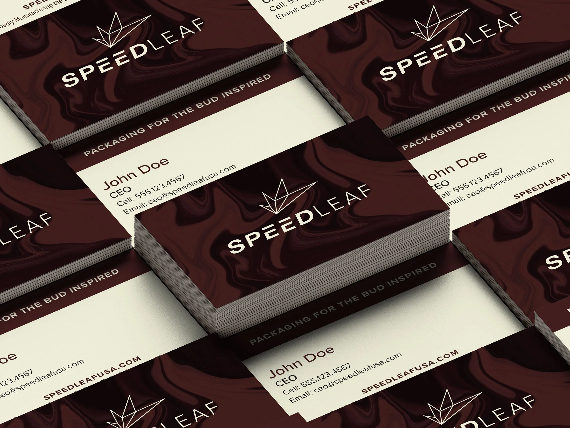
A Flexible Brand Design. Clarke Creative developed a cohesive voice and visual identity playing on SpeedLeaf’s new tagline: Packaging Solutions for the Bud Inspired. SpeedLeaf's visual brand reflects precision, innovation, and modernity. Its central, line art graphic features a paper airplane formed from a cannabis leaf. The illusion of movement is built into the SpeedLeaf typeface.
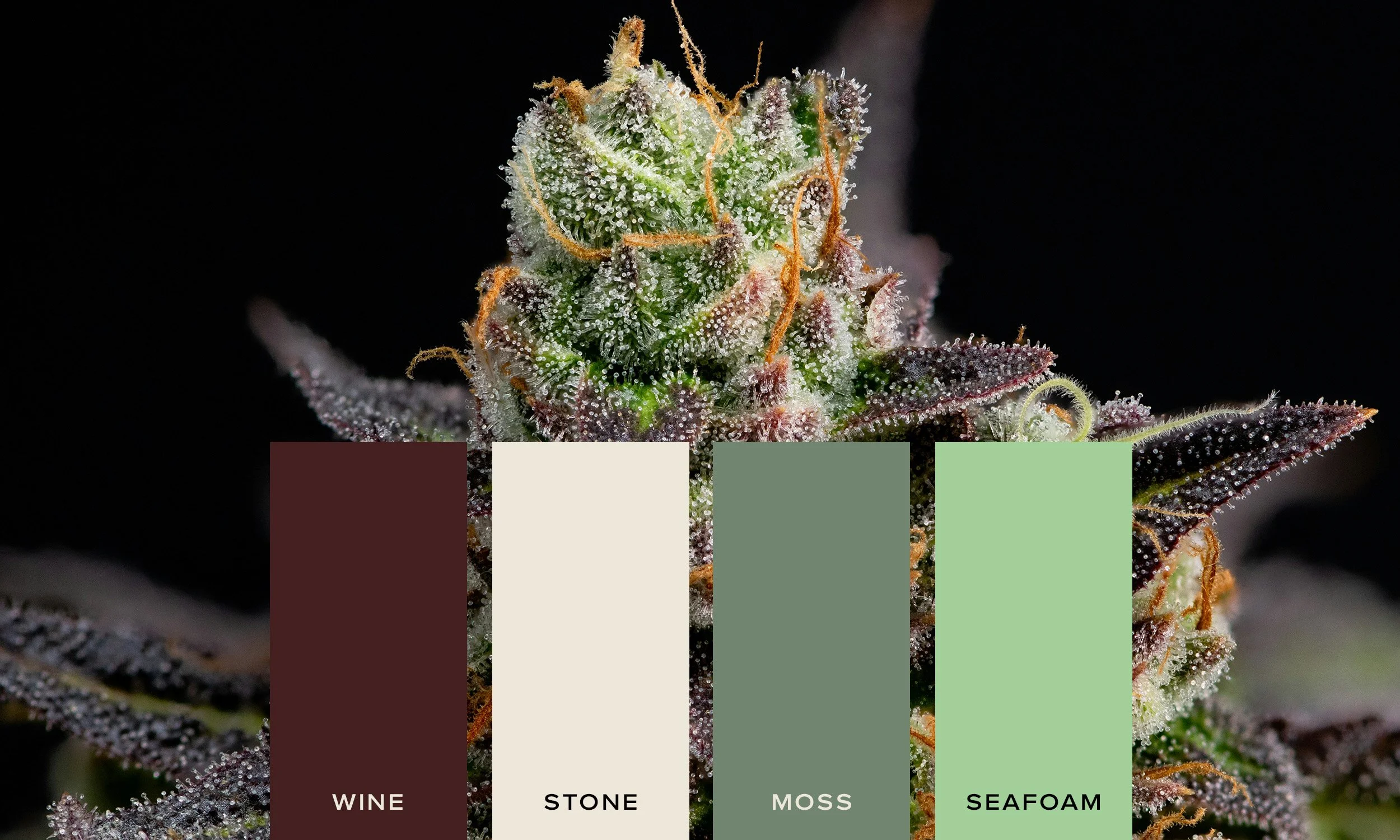
SpeedLeaf’s color palette takes inspiration from the hues of a cannabis flower. Its brand colors are warm, grounded, and elevated, intentionally matching the tone of the company’s brand promise.
Modern, approachable and balanced typefaces are used throughout SpeedLeaf’s branding.
The typeface models for DoobieToobie and EcoToobie coordinate with the SpeedLeaf logo, allowing for product expansion and the development of a cohesive master brand identity. Differentiating products by color enables market recognition and proves useful for internal SpeedLeaf operations.
Aligning Voice and Tone. SpeedLeaf’s tone imbues helpful expertise. Their brand voice is confident, grounded, professional, and assuring.
Stateside cannabis packaging built on expertise
“Clarke Creative was excellent to work with. They delivered the sophisticated brand we were looking for and helped us go to market with confidence. I highly recommend their services.”